Golden1 Credit Union
Golden1 Credit Union
Digitally Inclusive Design: Modernizing Golden1 Union's Banking Experience
Digitally Inclusive Design: Modernizing Golden1 Union's Banking Experience
Region
Region
USA
USA
Year
Year
2024- 2025
2024- 2025

The project itself :
Golden1 Credit Union, one of the nation's largest credit unions with over 1.1 million members and $20 billion in assets, needed to modernize its digital banking platform to meet WCAG 2.1+ accessibility standards while preserving brand integrity.
As Senior UX/UI Design Consultant, I led the redesign across web and mobile - translating accessibility requirements into a member-first experience that was easier to use for everyone, not just those relying on assistive technologies.
Achieved 30% higher accessibility compliance and 15% greater user engagement post-launch.
Figma, Confluence, Jira, Microsoft Teams
Figma, Confluence, Jira, Microsoft Teams
Senior UX/UI Design Consultant
Led user research and accessibility audits
Created wireframes, interaction flows, and prototypes
Advocated for accessibility within the design system
All about the Problem:
The existing digital banking platform was failing members who relied on assistive technologies. The issues weren't edge cases - they were daily obstacles.
Critical user flows didn't meet AA standards, putting Golden1 at compliance risk and excluding members with disabilities.
Missing alt text, broken focus order, and inaccessible labels left screen reader users unable to complete core banking tasks independently.
Different components and interaction patterns on web vs. mobile created confusion and increased customer support load.
Brand yellow against white backgrounds failed AA contrast for text and interactive elements, affecting members with low vision.
10 Digital Banking Members Including members using screen readers, keyboard navigation, and other assistive technologies
5 Product & QA Team Members Internal stakeholders responsible for accessibility testing and bug prioritization.
3 Customer Support Representatives Front-line staff fielding accessibility-related issues from members.
"The existing digital banking platform was failing members who relied on assistive technologies. The issues weren't edge cases - they were daily obstacles."
-Attribution Sarah M. · Screen Reader User, Golden1 Member
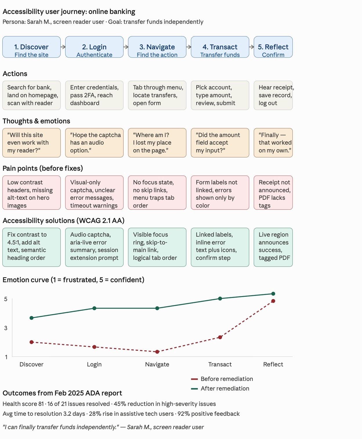
Mapping the Member Experience
Before I redesigned anything, I mapped what it actually felt like to bank with Golden1 as an assistive-technology user. The map traced four stages - Login, Account Review, Transfer, Logout - and surfaced emotional lows at every authentication touchpoint.
Each stage was scored across screen reader compatibility, keyboard navigation, and member confidence. Authentication and transfer flows scored lowest - these became the design priorities.
The project schematically :
I worked from the broadest structural decisions down to the smallest interaction details, making sure every layer was accessible before adding the next.
This is an examination of users and their needs, which adds realistic context to the design process.
Multiple rounds of UAT and accessibility walkthroughs with real assistive-tech users revealed issues automated audits missed - spacing problems for screen magnifier users, ambiguous focus order in the transfer flow, and contrast issues on disabled button states.
Tab order skipped key actions in the transfer flow. Fixed by restructuring the DOM and adding explicit
Disabled buttons fell below 3:1 contrast and became invisible to low-vision users. Adjusted token to meet AA standards.
Mobile action buttons were below 44×44px minimum, causing missed taps. Scaled to 48px and added 8px padding.
Every project has a moment where two right answers compete. For Golden1, it was color.
Golden1's brand yellow is instantly recognizable from physical branches and marketing, but at standard application, it fails WCAG 2.1 AA contrast against white backgrounds. Preserving brand recognition meant compromising accessibility for over a million members. Compromising on yellow meant disrupting the brand identity across every channel.
Shift the brand palette darker to meet contrast at all sizes (rejected: undermines brand consistency). Use yellow as decorative accent only, never interactive (rejected: visually limiting). Build a semantic token system that keeps yellow as visual identity but auto-substitutes accessible variants for interactive states.
Option 3 - a semantic color token system. Yellow stayed as the brand identity. Buttons, text, and interactive states automatically mapped to accessible variants. Engineers got a single source of truth. Future components inherited accessibility by default.
Treating accessibility as a system (not a one-off fix) meant the next ten components would be compliant by default, without case-by-case review. This was the difference between a project deliverable and a lasting design system contribution.

The clear version :
With the system in place, I refined high-fidelity designs across web and mobile, applying accessible color palettes, responsive type scales, and consistent button behavior. The component library grew to 15+ reusable, WCAG-compliant pieces that reduced UI inconsistencies by 25%.
Below: redesigned screens across web and mobile. Each one tested with assistive-tech users before launch.
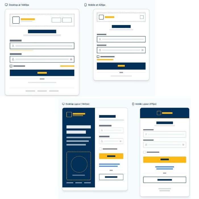

I built reusable, WCAG 2.1+ compliant components into Golden1's existing design system: accessible checkboxes, switches, radio buttons, progress indicators, semantic status messages, and form fields with proper focus states.


The project schematically :
Sixty days after launch, the impact was measurable across compliance, engagement, and team efficiency.
Driven by reduced WCAG violations across critical user journeys, improved screen-reader compatibility, and standardized UI components that made essential banking tasks accessible to all members.
Enabled by the new component library and reusable patterns, which gave engineers production-ready specifications and significantly reduced handoff friction.
Achieved through standardized component libraries aligned with both ADA and brand guidelines, creating a cohesive experience across web and mobile.
What began as a compliance audit became a shift in mindset.
Designing with accessibility at the core turned frustration into confidence for every user.
What worked
Building accessibility into the design system from day one not as a retrofit, but as a core principle.
Cross-functional workshops with Level Access, QA, and engineering turned accessibility into a team success.
Real user testing with assistive-tech users surfaced issues automated audits missed.
What I'd change
Engage QA in accessibility planning earlier.
Testing frameworks should be defined alongside design tokens.
Document component decisions in Confluence sooner, so the system became a living reference for the wider org.
Build a public-facing accessibility statement to make Golden1's commitment visible to members.